Media queries, HTML email design and Gmail
It is estimated that smartphone market penetration in Australia is between 65-75%. With the rapid rise in smartphones there has been a rapid rise in email being opened on smartphones. Email should be optimized for email in this day and age. The benefits of mobile friendly emails are well documented. This post isn't about why you should be sending mobile optimized emails, it is about the two main techniques used optimize them - using media queries and responsive/fluid design.
There has been a rise in innovation in email design recently. It is growing up in a big way. There are people like Justin at FreshInbox and the team at Litmus who are constantly pushing emails to the next level - which is awesome. This really excites and motivates me. However a lot of the cutting edge things that they are doing only works on a select few devices and email clients, which I find impractical. The things that Justin and Litmus do have fall backs for painful email clients, and they fail well in these cases, however I liken it to cross browser testing. If something works in Chrome and Firefox but not Safari, even if it is failing well, I would say that is a problem. My ideal is finding that perfect middle space where your get maximum compatibility and maximum awesome. If all I designed emails for was Apple mail and iPhones I would be very happy. I would be innovating for days. However we have Outlook, Gmail and Android to think about, let alone the myriad of weird webmail clients out there.
Gmail is one of the biggest thorns in email's side. For such an ubiquitous mail client from a tech company its CSS support is appalling. Well not CSS technically - style tags - it strips/ignores them, kind of.. It's complicated... (There is a work around for the desktop client that doesn't work for the mobile client/apps.)
From my latest tests in Litmus, Gmail is the only email client that requires all the styling to be inline. This is not limited to just the desktop client but also the apps, both Android and iOS. I was hoping that the launch of Inbox by Gmail would fix or at least improve things, however this was not the case. It is 2015 and the only way to style emails for Gmail/Inbox is to do it inline (which is ridiculous). Media queries need style tags, if style tags don't work media queries will not. If your email relies completely on media queries to be responsive then you are really only doing half the job.
The native iOS mail client dominates mobile mail clients. We all know and love the iOS mail client - it just works. However this is not really a true representation of the mobile ecosystem. Towards the end of last year Gmail started caching email images. Email tracking relies on the loading of images from a particular server. By caching images Gmail has effectively eliminated marketers ability to track opens. Not only this but as the images are cached all the opens looks like they are from a desktop. Gmail has become a black box.
When we design email for mobile we generally just think of iOS, however in Australia Android has upwards of 66% of the smartphone market share. If there are more Android devices then Apple ones why are the stats telling us there is there such a significantly larger portion of emails being opened on iOS devices? I think it is simply because we don't know that the emails are being opened on Android devices - because Gmail.
In November last year the Gmail app for Android started supporting other mail accounts. The Gmail app is easily one of the most popular mail clients for Android currently, and just by the fact that it comes pre-installed on Android devices now would mean seeing it rise in popularity. However due to it being Gmail it suffers the same problem of not rendering style tags and not tracking opens. I don't think open tracking is affected for other mail accounts in the Gmail app, however I will have look into this to confirm it.
The use of Gmail is not limited to just Google accounts too. Google Apps for business use a re-branded version of the Gmail client. These corporate clients are using the Gmail client without it being flagged as Gmail.
The point I am making is that one simply cannot rely on media queries for all your responsive needs.

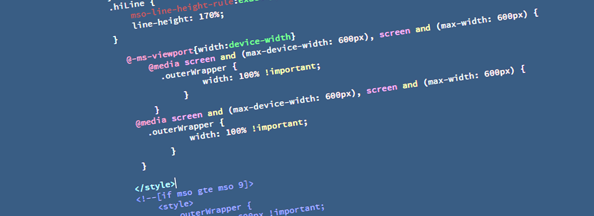
Media queries are the easy option - snap to a new layout when the screen is at a particular size. Using alternative fluid methods can be complicated and limiting which is what deters people.
I rely almost entirely on min and max-width and outlook conditional comments for my mobile optimized email layouts. This technique is referred to as fluid design. This can be tedious but results in emails that will work on all mobile clients, not just iOS. Using min and max-width can be limiting when compared to media queries, especially when considering interactive emails, however I think the benefit of the email working in more clients, especially Gmail, is worth it. Once the basic layout of your content is working on smaller screens you can then use media queries to add the final touches.
Before you send your next marketing email check to see what it looks like in the Gmail app. You may be surprised.